Elements of Design

This week, we discussed Point, Line, Plane, and Volume and where we see them in architecture, interior design, and other areas. In this blog, I will talk specifically about where these elements can be used in interior design.
To start, we talked about how a point is the most basic element in design. It is a stable point within a visual field and becomes a focal point when placed in that field. When placed in the center of a visual field, a point is stable and organizes the elements around it. However, it becomes an aggressive point when it is offset within the field and can sometimes make it seem disorganized. Two points in the same field suggest an axis and can be used to create a passage through the space. There are four different uses of points that we discussed: stable, aggressive, two connecting a line, and extended. In the first example below, the mirror above the fireplace is in the center of the visual field, making it a stable focal point. In the second example, the artwork above the chair contains a black circle that is offset from the center, making it an aggressive focal point.

The next two examples have to do with the use of multiple points. In the first example, the columns act as points that connect lines forming a passage from the viewpoint to the windows at the back of the room. In the second example, there is a passage formed between the viewpoint and the table, but the point is extended by following the length of the table to the widows.

The second design element that we discussed was line. The four main types of lines are horizontal, vertical, diagonal, and curved. Horizontal lines create a sense of restfulness and stability, guiding the viewer through a space. Vertical lines suggest upward movement and create a sense of strength and permanence. Diagonal lines can suggest upward or downward movement, making a space feel unbalanced, but can also feel energetic and dynamic or create a sense of freedom. A combination of upward and downward diagonal lines makes a zigzag, creating restless hyperactivity or energy and excitement. Finally, curved lines appear graceful, with a sense of gentle and "natural" movement, whether informal (free form) or formal (geometric). In the first example below, the horizontal lines in the floor draw the viewer's eyes into the next room, showing where they are supposed to go. In the second example, the vertical lines on the fireplace serve to draw the eye of the viewer up towards the ceiling.

The next two images are examples of the more complex lines: diagonal and curved. In the first example, the diagonal lines on the wall behind the bed create zigzags that not only accent that section of the wall but also draw the viewer's eyes downward toward the bed, which is the focal point of the room. In the second example, the wall is made up of curved lines that create a very dynamic but gentle movement that appears very natural.


The next three images are examples of the three different kinds of planes. The first example shows a floor plane with lines that run parallel to each other and unite the sitting room and the kitchen. The second example shows a wall plane that uses both horizontal and vertical lines to create a dynamic pattern, which is emphasized by light coming from around the squares. The third example shows an overhead plane that uses curved lines to draw the viewer's eye to the end of the space while also keeping them entertained with the flowing movement of the lines.

The last element that we discussed was volume, or space, which is created when multiple planes are joined together. There is positive space, which is the enclosed space that we enter into that contains other forms, and there is negative space, which is left mostly empty or devoid of forms and gives rest to the eye. The first example below shows a negative space, where there are very few forms and things to distract the eye, and the right wall has gaps between the vertical lines that give the space a sense of openness. The second space is a positive space, which is full of forms that make the room feel full but few enough forms that the room does not feel crowded.

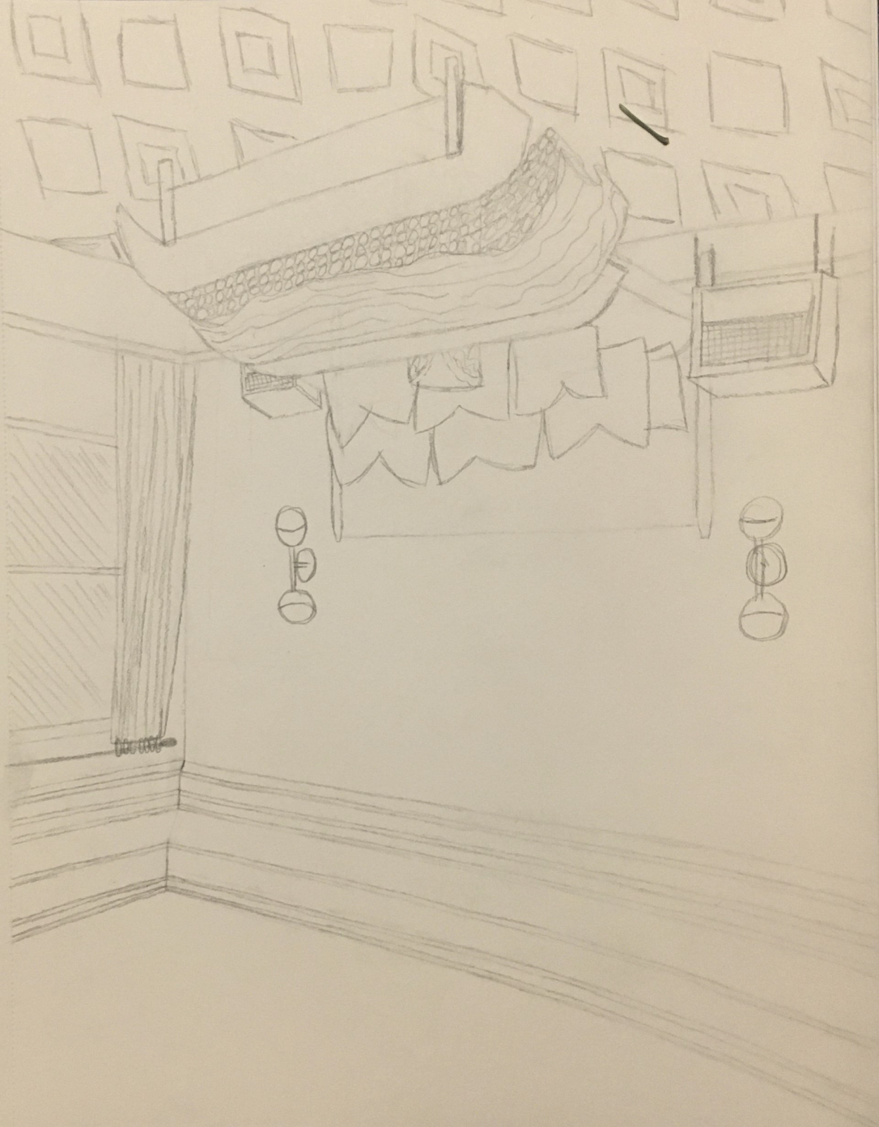
One of our other assignments this week was to find an interior space and draw the picture upside-down. When you see things that are upside-down, they do not look the same and are not familiar. This is because we can recognize familiar things when we are upright. When the object or image is upside-down, the visual clues do not work. The reason for this type of exercise is to see the difference between drawing with the left side of the brain versus the right side. The left side of the brain dominates your abilities in language, logical thinking, memory, and math, while the right side of the brain dominates your abilities in visualization, creativity, music, and graphic art.


I love the amount of detail that you have gone into regarding each point. Not only did you show each section through your slides, but you described them well. I appreciate also the organization of the points and the neat flow of each section into the next.
ReplyDeleteI really liked how you described your examples to make sure that your point was clear. I also appreciated that your text was broken up into smaller segments so that it did not seem too dense. Overall, I think you got your point across and made your blog look aesthetically pleasing at the same time.
ReplyDeleteI really enjoyed how you had a detailed explanation for each of you slides. reading through those gave a very nice summary of what we learned this week!
ReplyDeleteKatherine,
ReplyDeleteYou Blog entry is exactly what I am looking for. Beautiful and professional presentation with words and images that support each other. You incorporated our assignment into the blog and it was effective. I really enjoyed your description of the sketching assignment and your sketches.
Total Points: 50/50